

Digital Prompt Cards
The following links provide tools for testing if the content in your digital solution is following accessibility guidelines. For more guidelines, see www.w3.org/.
W3C sets web standards as building blocks for the web, allowing developers to follow blue prints for their digital solutions. W3C have made standards for accessible web content, known as WCAG 2, which are standards specifically oriented towards creating accessible solutions.
We have made the Digital Inclusion Prompt Cards that describe and exemplify some of the guidelines from WCAG 2. The options for guidance and testing of your solution, listed on the page below, are supplements to the cards.


Keyboard Access
Watch a step-by-step video tutorial to learn how to evaluate and improve keyboard accessibility on your website or application:
Check your keyboard accessibility through a video guide
Among other tips for testing the keyboard accessibility, this website provides guides on using the embedded screen reader tools in your computer, revealing missing accessibility:
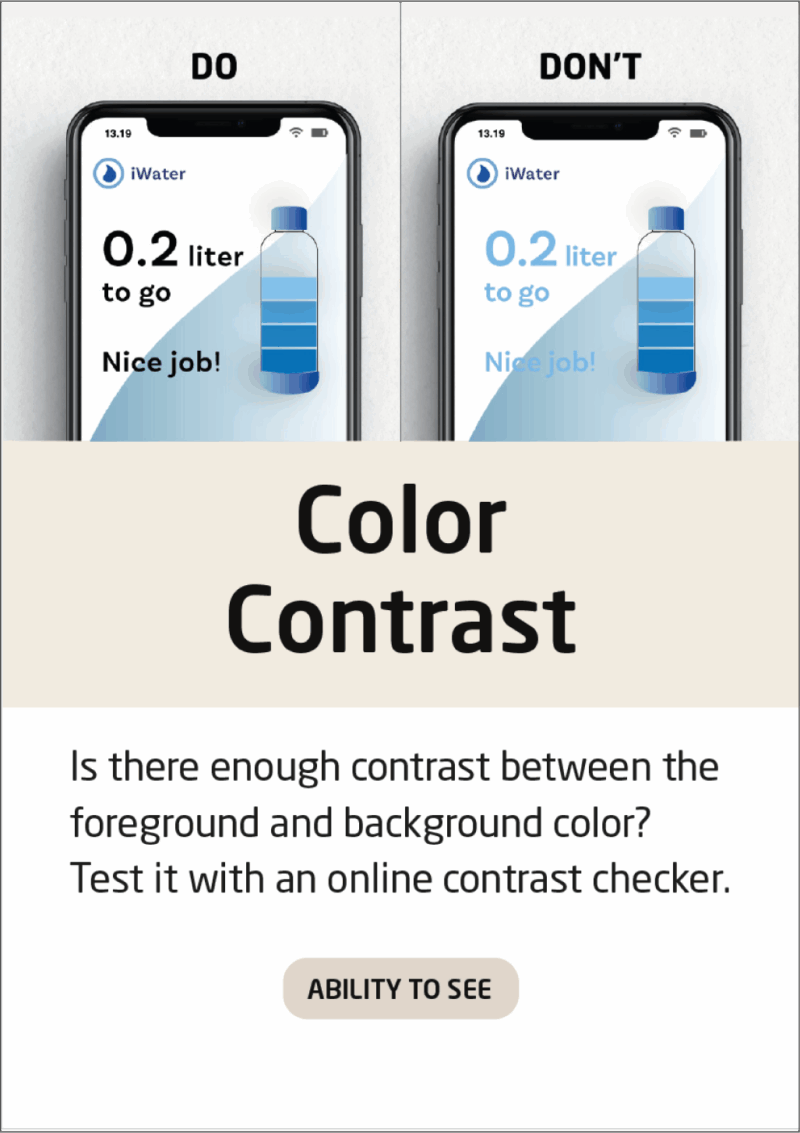
Color Contrast
Find the codes of the colors used as text and background in your solution, and check if the contrast between them live up to the WCAG standards:
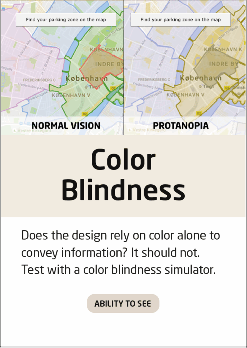
Color Blindness
Discover the pitfalls of your solution when used as colorblind by dropping the URL of the solution to the color blindness checker, and choosing a type of color blindness:
Experience your solution through the eyes of a color blind person
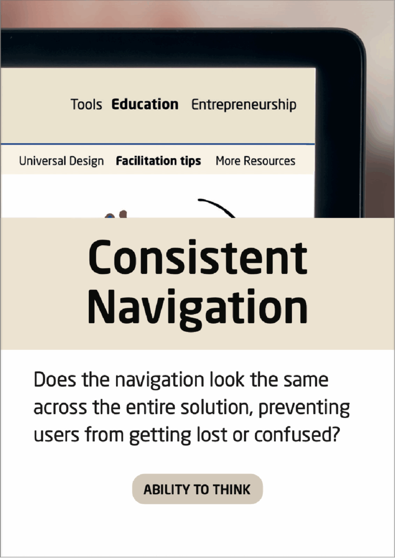
Consistent Navigation
Making a logical and consistent navigation is important to ensure a good user experience.
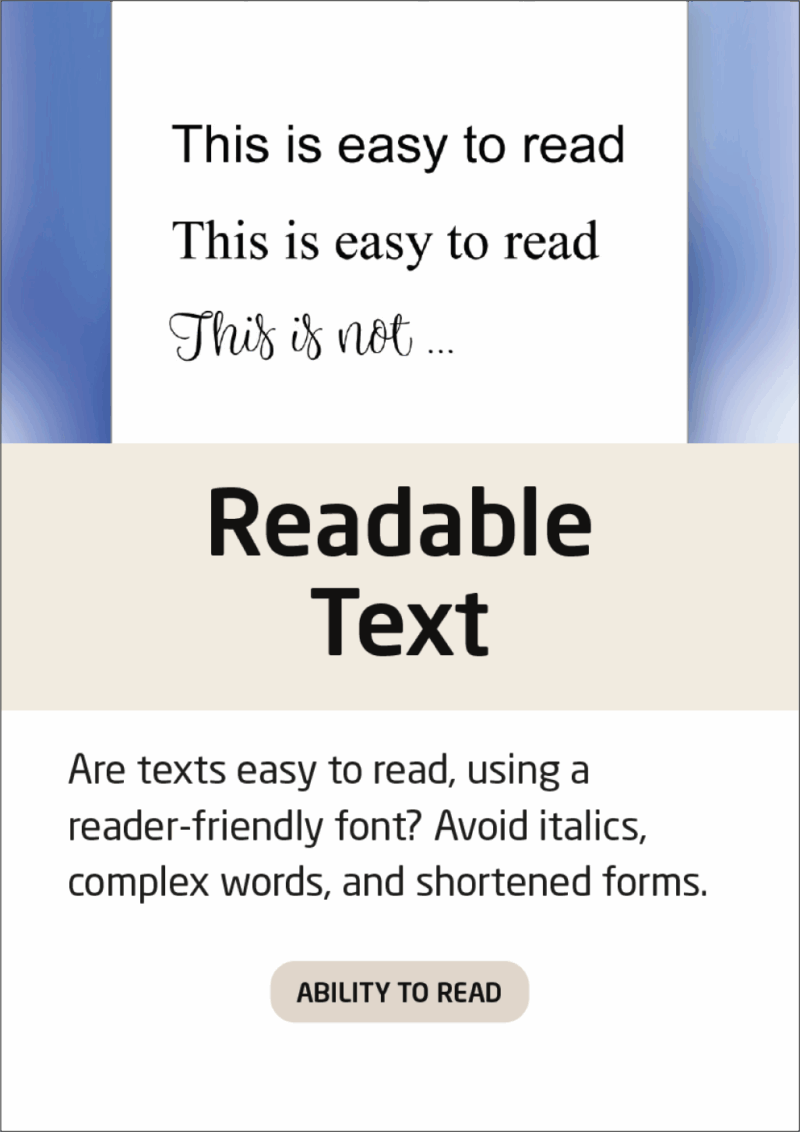
Readable Text
With a language readability checker, you are able to notice what sentences in your written content that are not easy to understand:
Check if the language used in the solution is easy to understand
Some fonts are easier to read than others. Learn more about this, as well as get inspiration on what fonts to use on your solution:
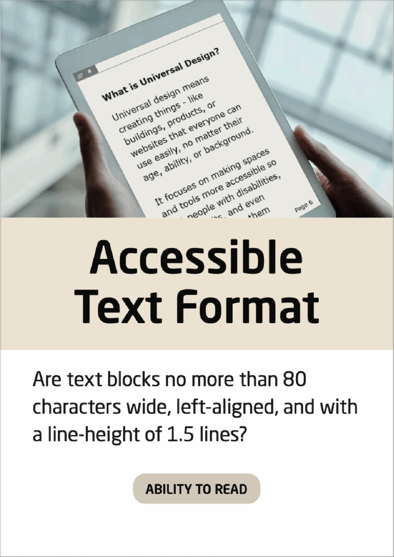
Accessible Text Format
When creating text paragraphs, you have many options to make the content accessible – down below, the most important formatting tools are explained
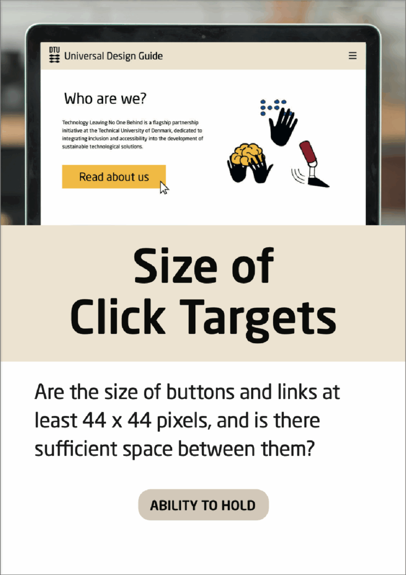
Size of Click Targets
While the suggested target size of 44×44 pixels is a good rule of thumb, the world of click targets is a science of its own. Did you know that the term “Rage taps” refer to the frustrated action of keeping to click on a button that does not work as intended?
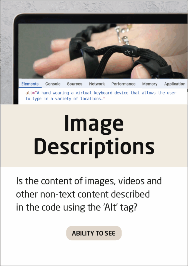
Image Descriptions
Watch a step-by-step video of testing if your images have ‘alt’ texts, as well as adding alt text to your solution:
Check if your images have ‘alt’ texts through a video guide
Creating good and informing image descriptions can be difficult. Upload your picture and get help to make a fitting image description:
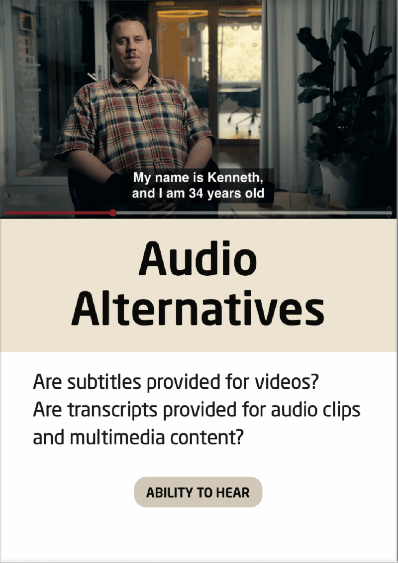
Audio Alternatives
Making good subtitles is more complex than it seems. Choosing a natural language and easily understandable words are only some of the things important to remember, when creating subtitles.
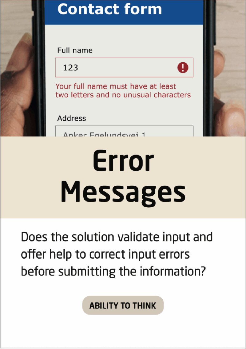
Error Messages
When creating error messages, be aware of the phrasing – as well as how much information about the error is communicated to the user.
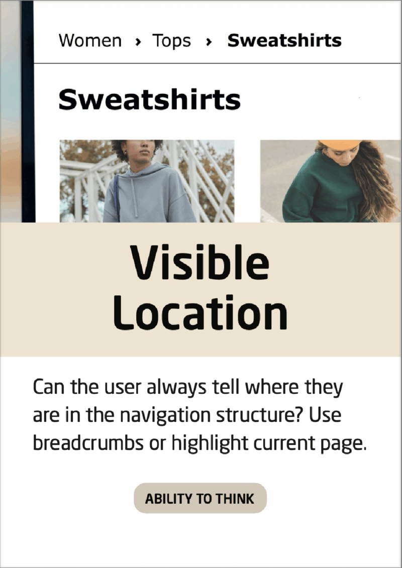
Visible Location
Browsing on the internet quickly reveals, who masters the communication of ‘visible location’ and who does not. Many shopping websites are good at keeping a clear location because of their many product categories. An example is provided below.
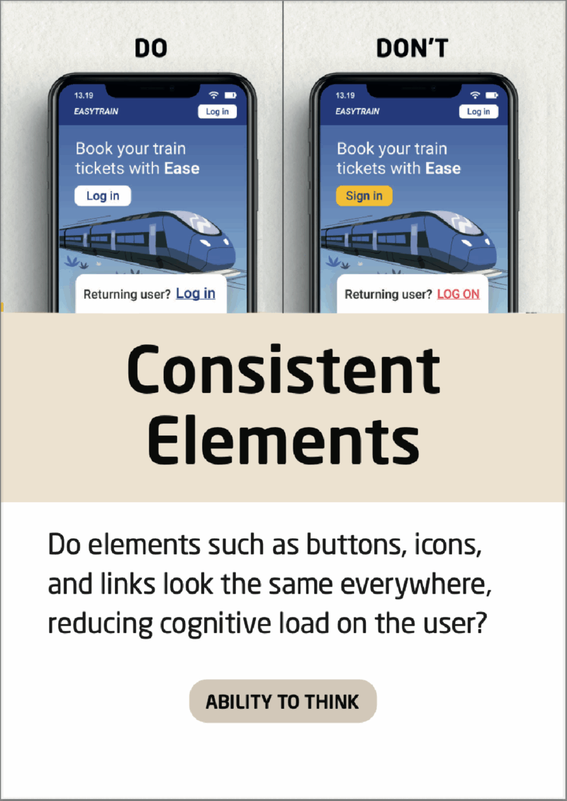
Consistent Elements
Consistent elements form a better user experience, as well as an aesthetic cohesion throughout the solution.
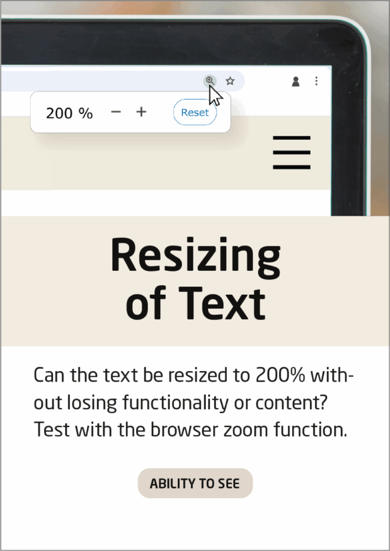
Resizing of Text
Test if the text paragraphs in your solution are fully readable at zoom: 200 %.
Check out a video on how to use the zoom function in different browsers
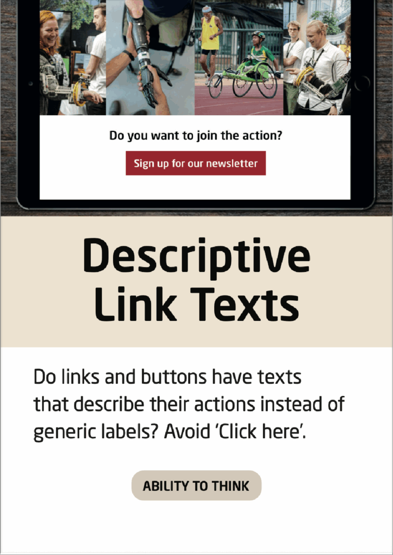
Descriptive Link Texts
It is important that the user knows what they are accessing, when clicking a hyperlink.
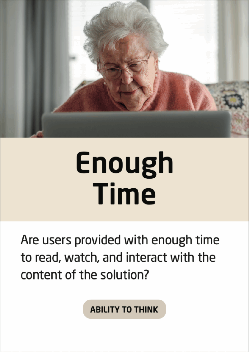
Enough Time
Sometimes, seeing an example of someone, who did not succeed in creating a user friendly experience, is helpful. The banners in the top of this website is a good example of getting too little time to both read and interact with content.
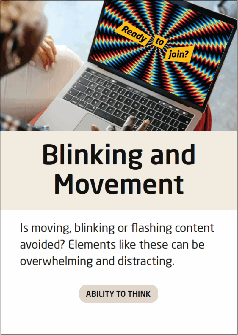
Blinking and Movement
If you have blinking or flashing content, assessing the impact on photosensitive users will be beneficial:
Check your solution with the Photosensitive Epilepsy Analysis Tool
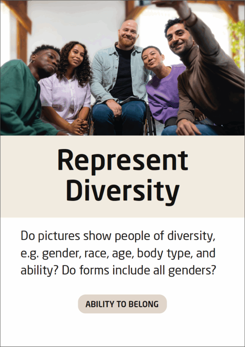
Represent Diversity
When creating a form, it should represent diversity in terms of language used and respondent options:
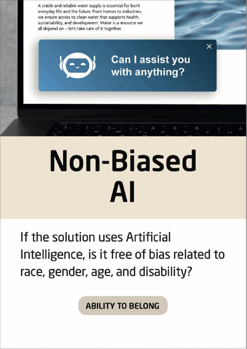
Non-Biased AI
Even though an AI cannot be completely free of bias, the impact of biases can be minimized through awareness. Use largely acknowledged AIs and be aware that an AI is always affected by its’ data set.
Other Resources
Using a “speech to navigation” plugin on your website can help you attract more users for your solution:
Use a plugin that enables users to speak to navigate your website
There are several companies that perform overall accessibility checks. Some of them can be used as extensions for your browser: